Burberry changes it logo for the first time in two decades. It’s not every day that a major fashion brand changes it logo but British fashion house Burberry have done just that… and the bold move has been met with criticism.
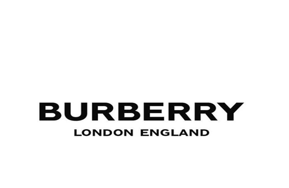
Riccardo Tisci, who took over as Burberry’s Chief Creative Officer back in March, has revealed the new logo on his Instagram. Tisci enlisted the help of graphic designer Peter Saville to update the iconic logo, which has been replaced with a clean, bold sans-serif font.
Speaking about the new designs, Tisci said, “Peter is one of our generation’s greatest design geniuses. I’m so happy to have collaborated together to reimagine the new visual language for the house.”
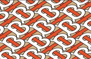
As well as a new logo, Burberry has also gotten a new monogram. The red and tan plaid has been replaced with an orange and fawn colour interlocking ‘T’ and ‘B’ design, a nod to the brand’s founder, Thomas Burberry.

Burberry changes it logo for the first time in two decades
After seeing the new logo and monogram on social media, fans have expressed their disappointment.
“”Why?! No need to change such iconic logo. Really not sure about the new one…..why?” one fan wrote.
“So disappointing!! OMG…. It ruins Burberry’s brand image!”, another added.
Love or hate the new design, the monogram print will be used on Tisci’s upcoming Burberry designs, set to officially debut this September when he shows his collection at London Fashion Week.


